Uber Partners with Denver Transit — What Could Go Wrong?

There’s no other way to say it: I hate the Regional Transportation District’s mobile app. Which is why it’s exciting — and troubling — that RTD partnered with Uber to allow riders to plan trips and buy tickets from within the ride-sharing company’s app.
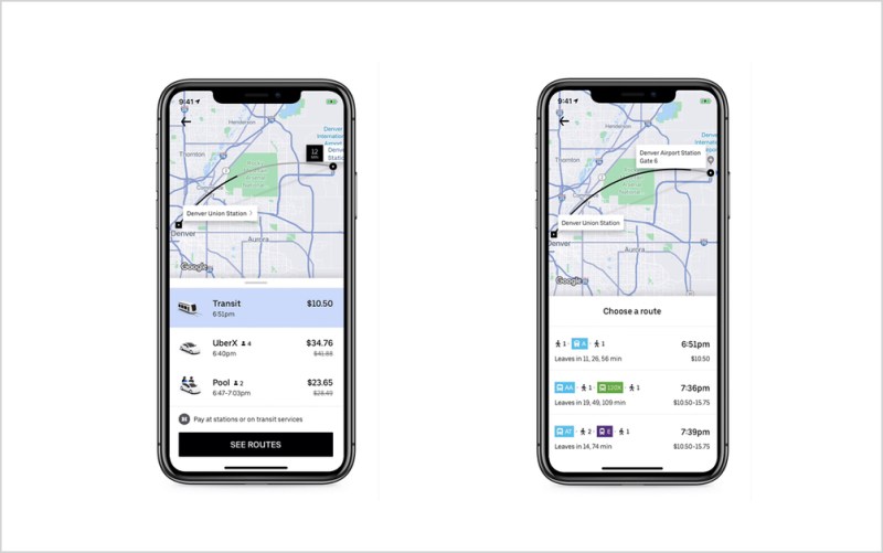
In the coming weeks, you’ll be able plug an address into the Uber app will see RTD bus and rail options up alongside suggestions for different Uber services, the two organizations announced today. In a first for Uber, customers will eventually be able to purchase RTD tickets within their app, too.

“This is Uber’s first in-app integration with public transit,” said David Reich, Uber’s Head of Transit. “We’re excited it’s happening in Denver.”
The idea of entering a destination into a single app and choosing from multiple mobility options, including transit, bikes, scooters and ride sharing services, could be an important tool in reducing Denver’s overwhelming dependence on cars.
But it could be dangerous to leave this in the hands of a company that has previously been hostile to cities as they sought data from the company and attempted to create common sense regulations that would help manage traffic.
The announcement also comes as many people are growing concerned about how tech companies use their location data. And all of this raises other questions, like why would RTD partner with a company that will show you, in real time, how much faster you would get to work by clicking the ‘send to Uber’ button versus pushing the ‘tell me about my lame bus options’ button.

And then there’s RTD’s app.
After I saw the announcement this morning, I immediately opened up the RTD Mobile Tickets app — and then suffered a 10-minute fight with a clunky interface as I tried to buy a ticket. Although I’ve used the RTD app without a problem in the past, that wasn’t the case today. It repeatedly confused me while forcing me to navigate an uncountable number of steps and screens. Nearly every push of a button was an uncertain guess. Unable to login, I attempted multiple password resets.
After all of that, I wanted to throw the phone across the room. I had the sense to give up and close the app instead. When I came back later, it was ready to sell me a ticket. It turns out, an account and password aren’t needed at all to buy a ticket. But getting one still required me to navigate a confusing set of steps and error messages. On top of this user experience nightmare, everything about the RTD app is ugly.
RTD isn’t alone in designing a barely functional mobile app. Even in San Francisco, the nation’s tech capital, the Muni Mobile app is just as ugly and only slightly more functional.
RTD says it has sold 2 million tickets via its app since it launched in 2017. That goes toward the roughly 200 million trips the agency has handled in about the same amount of time.

Compare one of these sloppy, publicly-funded apps to the friendly, easy-to-use user experience design found in the Uber, Lyft and scooter apps.
Offering multiple mobility options inside a single app isn’t a new idea. MaaS Global, a Finnish company, works with transit systems to offer a slick app that helps people plan trips that include options like biking, public transit, and private services like car sharing.
Unlike RTD’s deal with Uber, these Mobility as a Service, or MaaS, apps allow transit operators to give riders options beyond buses and trains — without supporting the interests of a ride-sharing company.
In fact, Uber isn’t known for playing nice. It has a history of bullying and menacing city and state governments while forcing users to accept questionable policies surrounding how the company uses their location data. And many riders have already abandoned RTD as Uber became more popular: Last year 7.3 million fewer rides happened on RTD compared to 2014.
But there is a bright side. Many regular Uber users may habitually open the app when they need to go someplace. If they start to see that public transit can get them where they want to go just as fast as an Uber ride, maybe this collaboration will shift some of those people out of cars and onto transit.
Before I get too optimistic: I wonder how often transit will be better than Uber? I envision seeing Twitter aflutter with screenshots showing how RTD trips compare to Uber. I imagine a clever hashtag, where riders share examples of how a $6 Uber ride might be twice as fast as a $3 RTD ride.
But maybe that, too, is a good thing. It could be a backdoor way to get RTD to do a better job before losing even more riders to Uber.
To learn more about the Uber and RTD collaboration, visit this RTD website.
Correction: This story has been edited to reflect that the RTD Mobile Ticket app launched in 2017, not 2014, and the number of passenger boardings since that time is roughly 200 million.
IT IS NOT LOST ON ME that in a story that criticizes poor user experience, Streetsblog Denver’s own website renders several images in this story blurry. We’re working on it. You can help. Give $10 now. —AB
Get Streetsblog Denver’s daily headlines delivered to your inbox. Sign up for our daily e-mail digest.


