Use These Maps to Advocate for Street Safety Fixes in Your Neighborhood
Where are Denver’s most dangerous streets? What are the locations in your neighborhood where street design interventions can make the biggest impact?
Good data is essential to prioritizing street changes to prevent traffic deaths and serious injuries. And if that data is open and accessible to the public, residents can advocate more effectively for changes that will make a difference.
Denver’s Vision Zero website has gotten better in this regard since launching in 2016. It now includes two maps that anyone can explore to build a case for street redesigns.
If you want a straightforward look at the crash history of specific intersections, use the city’s Vision Zero crash dashboard.
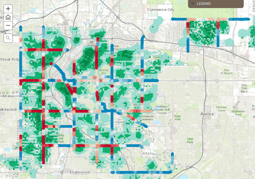
A new map from the city lets you see where different demographics are most at risk of traffic injuries and fatalities. It’s not the most intuitive map, so here’s a quick breakdown.
The map overlays Denver’s most dangerous streets with population densities of six “communities of concern”: children, senior citizens, people with disabilities, low-income households, people with health problems like obesity, and low car ownership households.
These maps let you delve deeper into each category. For example, if you’re worried about speeding traffic near your school, you can look up the nearby intersections with for curb extensions and better crosswalks.
In the map above, for instance, the dark green areas have high concentrations of kids and schools, and the dark red areas mark streets with high crash rates. So street safety fixes in areas packed with dark red and dark green, like Westwood, would do the most to benefit kids and students.
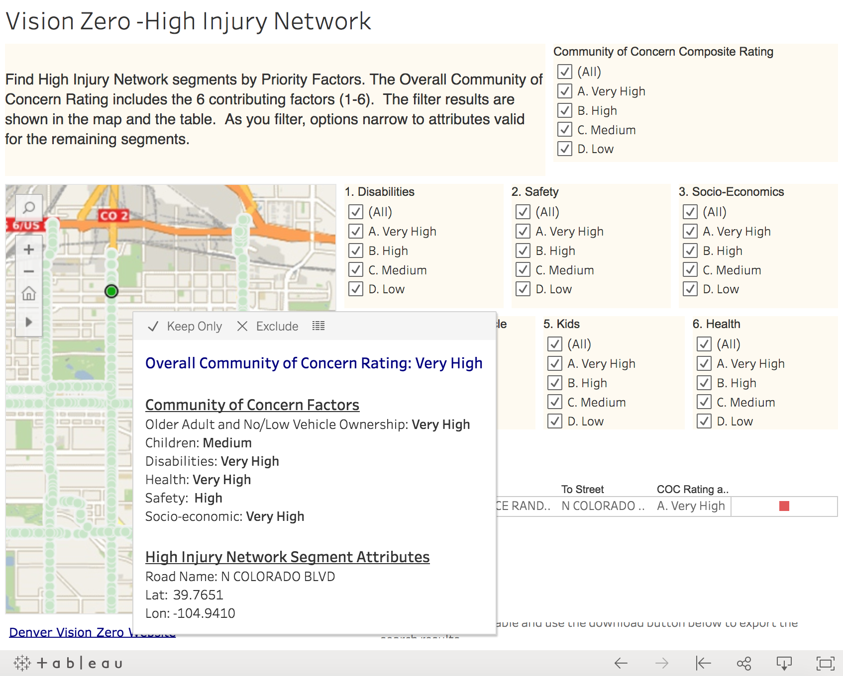
You can toggle between the different “communities of concern,” compare them, or combine them, as well as download the results in various formats.
These tools are a bit clunky. If you want to see a good, accessible, streamlined tool for mapping traffic injuries and fatalities, check out New York’s Vision Zero View. For now, these tools are what Denver provides to make the case to your City Council member for safety improvements.
Streetsblog has migrated to a new comment system. New commenters can register directly in the comments section of any article. Returning commenters: your previous comments and display name have been preserved, but you'll need to reclaim your account by clicking "Forgot your password?" on the sign-in form, entering your email, and following the verification link to set a new password — this is required because passwords could not be carried over during the migration. For questions, contact tips@streetsblog.org.